Spring:
This is a somewhat difficult category to work with here in Norway in my opinion because we only have two seasons: eight months of winter and four months of fall. Its true! Anyway, there are some signs of spring here in Norway too.
"Action"

One of these signs is the first walk on the beach when you can feel the warmth of the sun. This was taken at Brusand on one of the longest sandy beaches in Norway. As you can see the motive is of my dog pouncing at some dried up seaweed blowing in the wind. I just love the randomness of the photo and the colors were so sharp and clear that day I did not edit it at all. Just this one little fast movement is captured and frozen and it makes the picture full of life and movement. Hence the tile "action". The thing I love the most about this photo is that it captures something that the eye can not. The beach grass in the background looks soft and compliments the texture of the dogs fur. The sand getting thrown up in the wind also contributes to make movement. Click on the picture to make it bigger, and see all the details.
"Fishermen's Friend"

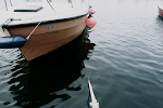
This was taken at a dock at Jæren. These old little boats dare the cold north wind every spring and so do the people on them. I have altered this picture a little. The biggest difference is that I have cropped it, and thats what I liked about it. The crop makes it a little abstract and unrecognizable. I have also laid an antique effect on it to make it look older. I think it complemented the feel of the picture. This picture was quite dull before the crop but after the diagonal line of the dock cut through the photo and made it quite dramatic. It also had an effect on the depth of the picture. I also like the details in the chains and ropes on the dock.
Travel:
How do you portray travel in a photograph? This was certainly challenging but after a while I got some shots I wanted to use in this category. Traveling is one of my favorite things to do. I love to see new places and new faces, so this category was a fun one to work with.
"Lonesome Traveller"

This was also taken at Brusand. I just have to say, what a great day to take photographs. The sky was so special and unique that day. If you look at the clouds you can see they make almost a pattern over the sky. I also like the depth in this picture. The beach looks never ending. This picture was one of my favorites. The rusty colored sand and beach grass makes a great contrast to the light blue sky.
"Flying"

This picture was taken at one of the highest points in Rogaland. Its called Preikestolen and ranges 604 meters over Lysebotn, the fjord beneath it. Being up there is an amazing feeling. I had to crawl way out to the edge of this cliff to get this picture, and yes it was really scary. Not only is the fjord a lovely composition in its own being but I made this photo black and white, to give it an aged effect, and I think it makes the viewer focus more on the scenery than if there were colors, for some odd reason. It also brings out the white tops of the mountains, which is cool.
Age:
"Web"

These old fishing tools were interesting photo objects. As soon as our teacher announced the category "age" I knew I wanted to take pictures of old items. They´re full of scratches and wrinkles and have a story to tell. The rusty metal makes a contrast to the blue net and the rope. The composition of the net also makes the picture more like a pattern since it a Macro, or a close up. I like that effect. Its gives the picture a sort of abstract feeling.
Sayings:
I´m a big fan of quotes and sayings. I like to think of them as guidelines on how to live a good life. I wanted to accentuate this point by taking pictures of everyday items that could symbolize a certain thing. And here are the results.
"Out of Sight, out of Mind" 

I love ferris wheels. They remind me of old romantic movies and cotton candy. I wanted to create a sense of soft nostalgia in this picture. I wanted it to look somewhat vintage. The composition of this picture is very interesting. It looks like the wheel just comes out of nowhere. The half circle and the diagonal lines stretching from the middle of the wheel to each seat gives the eye a lot to focus on. But the structure in the ferris wheel stops this composition from getting messy, and if you look at the bars on the wheel they almost make a pattern.
"Laziness is Smart Efficiency"

I found this hammock in the colony gardens in Stavanger. I thought it was very sweet and reminded me of lazy days out in the garden. The sun was shining that day and created very dramatic shadows. This made the picture both dramatic and bold, and at the same time soft and dreamy because of its motive.
Optional Category
Inspiration from Music
This category is the one i put the most work into. (if you don´t count climbing up to Preikestolen of course) Me, Katrine and Iselin modeled for each other, and had to stand out in the ice cold north wind in heels and tiny vintage dresses. It turned out to be absolutely worth it. The scene of this photo shoot was at Varhaug gamle Kirkegård. An old churchyard on the coast, completed with a little chapel and all. I was very inspired by photographer Patrick Demarceliers sometimes dark and gothic look and also Tim Burtons costumes and settings.
We wanted to create a a music video, or some sort of combination of pictures and the music we were inspired by. We also agreed that we didn't want picture perfect portraits. We wanted something edgy, unique. I focused on making these photos beautiful and scary at the same time. The music I used is very unusual and... well, creepy is probably the best word to describe it with, and I wanted to reflect this in my photos. So what happens when three creative students with a lot of inspiration find the perfect setting? Two words: Money shots.
Not only was this a huge amount of work, even though it was really fun, but the photos had to be really processed and worked on. You see, one of the things i really concentrated on was perfect skin. Iselin and Katrine have very good skin to begin with but it really takes a lot of work to get that porcelain "haven't seen the sun in ages" look, which is typical for Tim Burton.
My classmates Katrine and Iselin witch I collaborated with on this project also got fanastic shots. To see Iselins blog click here and to check out Katrines video "My body is a cage" please click here.
My classmates Katrine and Iselin witch I collaborated with on this project also got fanastic shots. To see Iselins blog click here and to check out Katrines video "My body is a cage" please click here.
Looking back at this year I can see a lot of challenges and I think everybody in our class can agree that that we have had our ups and downs this year, but the print and photography classes are the ones we most often looked forwards too. It seems that after you see the world through a camera, you see the it a lot differently :)
Laila
Laila = best i klassen! Sykt mange fantastiske bilder!
ReplyDelete