As the year started we were pretty much thrown into this course. I can still remember the assignment from our first class. Go outside and take pictures of an umbrella. After a while the pictures started getting really creative and exiting. This was just the start.
Photography has been the constantly in focus this year. The "five categories" have been giving us ideas and pushing us to take pictures all the time. Despite the amount of work in school generally, if you get an idea, you pick up a camera, before you loose it and you somehow always find the time to take photos. Bringing your camera everywhere you go, is also a habit I have gotten over the past year. Photography has become an art form that I really enjoy. I can also see a learning curve in the photos I have taken. I started out this year with pretty safe and standard photos, but the categories really push you further and make you take it to the next level every time,
Printing has been more experimental on my part. I have never worked with graphic techniques before and just getting to know how print differently was very exiting. I have to say I have become a big fan of stenciling. Printing also made me see that you can be creative and use your photos in different ways.
The blog... well its a love/hate relationship, sorta. On the bright side, you can post ideas, photos, inspiration and you can hand in every single piece of homework. Its really practical, not to mention accessible, because you can blog wherever you like you just need internet. On the other side, the blog always makes you feel like there is more you can do, and there is sort of an internal struggle of "who has the longest/best post this time" going around the class. But maybe thats a good thing? Anyway, Im just glad I get to share my work with other people. Its more social and inspiring than just a hand in.
Working in this class is often hectic and we really get a lot done in just a few hour. I think most people in my class appreciate that we have all those hours on tuesday, because you can often finish your project before the end of the day. Wonderful! You don´t have to worry about it later.
I have learned a lot this year. This class does not have a textbook and I think it should stay this way. Not only does it make the course depend more on the skills of the teacher, but also the effort of the students. Of course we have a curriculum but the lacking of a textbook makes the classes more free. In addition to just evolving and taking more interesting and challenging photos I´ve learned a lot about the technical aspects of photography. We have also learned about the usage of aperture and time value, which has been really great. There has also been a lot of challenges and you usually don´t you feel like you learn anything in school, but in this class you can really see and feel a curve.
This year has been very inspiring and I feel like photography is something I always can use, wether its just for fun or maybe professionally. Its such a wide work method and artistic outlet and you really can create wonderful things with a camera.
One of my favorite shots, taken in Florida at New Years Eve 09/10. This was after I learned how to use aperture value, a shot like this could never look the same with a blitz.
Last tuesday we were at The art museum of Rogaland to see an exhibition called Helsinki 1o. The exhibition featured students at an art school in Helsinki, Finland's capital. The student shown here studied photography. The young students were loaded with talent and creativity and i really enjoyed this exhibition. The most artistic additions to the exhibitions like photos by Ola Kolehmainen, Ilka Halso and Kalle Kataila were the ones I liked the best, but the pictures taken by Aino Kanisto were absolutely my favorites. She had an amazing way to portray light. Her photos also told stories, and some of them looked like still pictures from movies. Heres some examples:
This artist only uses herself when taking portraits. She also does some work with film and that influences her pictures.
A young artist named Susanna Majuri which was announced "Artist of the year" (2010) was also featured at Helsinki 1o. This was my favorite picture by Majuri.
This exhibition consisted mostly of very appealing images. Art now days can be very shocking and downright ugly sometimes, but this show was made up by very "pretty" photos. It was nice for a change to not go out of an exhibition and be totally freaked out of what you just saw.
I think this is my favorite photo this season. This photo is also featured in the video for the same project. It was also one of the first ones I noticed as "the money shots". The reason why I like this photo so much is that it shows the whole theme of the photo shoot. It was such a beautiful photo I even had to name it.
"Silver Tear"
This is a picture of my classmate Katrine. She was posing, the wind was blowing and the ocean was dark and wild. What can I say? All three of us who worked together on this shoot agreed that it was quite magical. This picture is very sad and dark. It shows a whole different side of my friend Katrine. I mentioned before that the picture is a summary of the whole theme. This is because it is seems beautiful and perfect, yet sad and trouble. Its sort of celebrates and glamorizes darkness. I also liked how the tear (it came from the wind, don´t worry) almost looked silver, or like glass. The sea in the background creates a steady horizon for the eye to rest on, yet the models hair blowing in the wind and the pearls create dramatic lines. I also liked the perfect looking skin and the glow from the models eyes. The combination of using a young woman combined with the black and white effect also makes a surprising and dramatic effect. Thanks Katrine! What a gorgeus shot!
So here we are at the end of the year, and this is the final hand-in of the "five categories". These last months I have been working very hard on getting original and beautiful photos. I have braved mean fishermen on Jærens coast and I have carried my camera up steeper hills than you can ever imagine. But by any means the category I put the most work into was the last one, "optional theme". I was so pleased with some of these pictures I want to get them framed and hang them on the wall! I want to send special thanks to my beautiful and very talented models Iselin and Katrine . Check out their blogs to see more of this project! So, here we go... the last "ten best pictures". Enjoy!
Spring:
This is a somewhat difficult category to work with here in Norway in my opinion because we only have two seasons: eight months of winter and four months of fall. Its true! Anyway, there are some signs of spring here in Norway too.
"Action"
One of these signs is the first walk on the beach when you can feel the warmth of the sun. This was taken at Brusand on one of the longest sandy beaches in Norway. As you can see the motive is of my dog pouncing at some dried up seaweed blowing in the wind. I just love the randomness of the photo and the colors were so sharp and clear that day I did not edit it at all. Just this one little fast movement is captured and frozen and it makes the picture full of life and movement. Hence the tile "action". The thing I love the most about this photo is that it captures something that the eye can not. The beach grass in the background looks soft and compliments the texture of the dogs fur. The sand getting thrown up in the wind also contributes to make movement. Click on the picture to make it bigger, and see all the details.
"Fishermen's Friend"
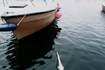
This was taken at a dock at Jæren. These old little boats dare the cold north wind every spring and so do the people on them. I have altered this picture a little. The biggest difference is that I have cropped it, and thats what I liked about it. The crop makes it a little abstract and unrecognizable. I have also laid an antique effect on it to make it look older. I think it complemented the feel of the picture. This picture was quite dull before the crop but after the diagonal line of the dock cut through the photo and made it quite dramatic. It also had an effect on the depth of the picture. I also like the details in the chains and ropes on the dock.
Travel:
How do you portray travel in a photograph? This was certainly challenging but after a while I got some shots I wanted to use in this category. Traveling is one of my favorite things to do. I love to see new places and new faces, so this category was a fun one to work with.
"Lonesome Traveller"
This was also taken at Brusand. I just have to say, what a great day to take photographs. The sky was so special and unique that day. If you look at the clouds you can see they make almost a pattern over the sky. I also like the depth in this picture. The beach looks never ending. This picture was one of my favorites. The rusty colored sand and beach grass makes a great contrast to the light blue sky.
"Flying"
This picture was taken at one of the highest points in Rogaland. Its called Preikestolen and ranges 604 meters over Lysebotn, the fjord beneath it. Being up there is an amazing feeling. I had to crawl way out to the edge of this cliff to get this picture, and yes it was really scary. Not only is the fjord a lovely composition in its own being but I made this photo black and white, to give it an aged effect, and I think it makes the viewer focus more on the scenery than if there were colors, for some odd reason. It also brings out the white tops of the mountains, which is cool.
Age:
"Web"
These old fishing tools were interesting photo objects. As soon as our teacher announced the category "age" I knew I wanted to take pictures of old items. They´re full of scratches and wrinkles and have a story to tell. The rusty metal makes a contrast to the blue net and the rope. The composition of the net also makes the picture more like a pattern since it a Macro, or a close up. I like that effect. Its gives the picture a sort of abstract feeling.
Sayings:
I´m a big fan of quotes and sayings. I like to think of them as guidelines on how to live a good life. I wanted to accentuate this point by taking pictures of everyday items that could symbolize a certain thing. And here are the results.
"Out of Sight, out of Mind"
I love ferris wheels. They remind me of old romantic movies and cotton candy. I wanted to create a sense of soft nostalgia in this picture. I wanted it to look somewhat vintage. The composition of this picture is very interesting. It looks like the wheel just comes out of nowhere. The half circle and the diagonal lines stretching from the middle of the wheel to each seat gives the eye a lot to focus on. But the structure in the ferris wheel stops this composition from getting messy, and if you look at the bars on the wheel they almost make a pattern.
"Laziness is Smart Efficiency"
I found this hammock in the colony gardens in Stavanger. I thought it was very sweet and reminded me of lazy days out in the garden. The sun was shining that day and created very dramatic shadows. This made the picture both dramatic and bold, and at the same time soft and dreamy because of its motive.
Optional Category
Inspiration from Music
This category is the one i put the most work into. (if you don´t count climbing up to Preikestolen of course) Me, Katrine and Iselin modeled for each other, and had to stand out in the ice cold north wind in heels and tiny vintage dresses. It turned out to be absolutely worth it. The scene of this photo shoot was at Varhaug gamle Kirkegård. An old churchyard on the coast, completed with a little chapel and all. I was very inspired by photographer Patrick Demarceliers sometimes dark and gothic look and also Tim Burtons costumes and settings.
We wanted to create a a music video, or some sort of combination of pictures and the music we were inspired by. We also agreed that we didn't want picture perfect portraits. We wanted something edgy, unique. I focused on making these photos beautiful and scary at the same time. The music I used is very unusual and... well, creepy is probably the best word to describe it with, and I wanted to reflect this in my photos. So what happens when three creative students with a lot of inspiration find the perfect setting? Two words: Money shots.
Not only was this a huge amount of work, even though it was really fun, but the photos had to be really processed and worked on. You see, one of the things i really concentrated on was perfect skin. Iselin and Katrine have very good skin to begin with but it really takes a lot of work to get that porcelain "haven't seen the sun in ages" look, which is typical for Tim Burton.
My classmates Katrine and Iselin witch I collaborated with on this project also got fanastic shots. To see Iselins blog click here and to check out Katrines video "My body is a cage" please click here.
Looking back at this year I can see a lot of challenges and I think everybody in our class can agree that that we have had our ups and downs this year, but the print and photography classes are the ones we most often looked forwards too. It seems that after you see the world through a camera, you see the it a lot differently :)
I´m going to be honest with you and say Im not a very big fan of Lino, but I really liked to work with dry-point printing. This technique was more similar to drawing as you can make narrower and more advanced prints. You start out with a clean metal plate. This can be any kind of metal but it should be rather soft so it will be easier to cut into. You can clean the plate off, or file it somewhat down by rubbing it with wet steel wool. After this, you find a strong and narrow metal object (about as small as the tip of a pencil) and start cutting out your print. after your done with the outline, you start to make lines. These can be far apart which will make the area lighter, or close together, which will make the area darker. This is mostly why this technique is a lot like drawing, because you can really control the shades and make smaller details.
When you´ve finished cutting out of the plate and your lines are deep enough (so you can feel them with a light brush of your finger) you can start the printing. First you put your plate on something moderately hot, like 30 degrees Celsius. then you roll on your ink. Make sure the ink gets into all the little corners and crinkles of your print. Your whole plate should look an even black tone. After this you put it back on the hot object. Don´t leave it there for long, because you will burn your fingers off if you do. Three to five minutes is plenty enough. Then start gently to rub off the ink. When you get off the worst, start using smooth newspaper to polish the plate. After this, get your printing device or press and find the paper you want to print on. The paper should be thick and you´ll also have to wet it down beforehand. Be sure to protect your press and the paper making you are printing on by putting extra paper under and over. It is also smart to put thick and soft film over the print before rolling the press over.
So this was result of my dry point. The idea behind this print was to make something maritime inspired. Thats why i stylized a picture of a mermaid, and put a banner in front of her. Our teacher wanted us to use elements that would create a sense of depth. This is why I put the banner in front of her and swept the hair backwards, to make it look like wind was sweeping it back. I really wish I could make this on a bigger format, since I think the impression would be a lot stronger. Pierre R. Renoir is a very famous french artist that uses dry point as his media. To Visit his gallery check out the "fun and useful links".
Tip! Wear old clothes because you are guaranteed going to get full of ink.
This month has been one mix of weird weather. The conditions have been hopping back and forth between spring and winter, and not only is this very confusing to my wardrobe, but the sky is acting rather peculiar sometimes too. No, it has nothing to do with the volcanic eruptions on Iceland, but for some weeks ago, when I was walking the dogs at the beach the clouds were very unique and spread beautifully over the sky. I haven´t seen anything like it before, but it sure made some good photographs.
This was taken on the way to the beach from the car. Don´t worry, my sister was driving...
The clouds got more and more compact as the day went on. I love how they sort of make a graphic pattern. This was taken at a beach called Brusand. As you can see, the sky was really dark to the north so it made the shots somewhat bright and dark at the same time creating a playful expression.
This was taken from behind the sand dunes. This really shows that you can find interesting photos everywhere so next time you´re about to go out pick up your camera and put it in your car, maybe you´ll get some interesting photos.
Last class we repeated linoleum printing. Obviously, we´ve done this before so we just made a small 6 x 6 cm print. The point was to see our photos in a different use than just the blog or hanging on a wall. So the first thing we did was to pick out a picture of something we wanted to use. I picked a picture of some dice in a car and a Wunderbaum (an air freshener for those who don´t know) with the american flag on it. I edited away the dice and then made the picture black and white with no gray-tones. This you do by adjusting the curves (Image - Adjustments- Curves or just Apple/Shift + M) to a vertical line. Then you go to your filter gallery and choose the cutout filter. Then you can adjust how dramatic you want the edges or the transition from black and white to be. Your image should be ready to cut out in a linoleum plate. After its cut out, you start just start printing! Since this was just a repetition we didn't exactly lay our heart and soul into it (we didn't have the time, we were so busy!) but I think it turned out pretty good.
This Americana Wunderbaum from my boyfriends car is now hanging on display at Forus VGS. Linoleum is a very easy and simple way to print but make sure to get fairly soft linoleum and watching out for the sharp lino knives is a must!
The norwegian photographer Rune Guneriussen had an exhibition of his newest project "Don´t Leave the Lights On" at Hå Gamle Prestegard February through March and I decided to go and see it. Actually, Guneriussen is an installation artist, but he also takes photos of his creations afterwards. Jæren, the place where I live is often his first choice when it comes to installations and photography. This exhibition consisted mainly of lights or electric objects in places they are rarely or never seen like by the sea, in the woods and so on. "Don´t Leave the Lights On" is probably a title to make you think of our consummation of electricity, and our frequent usage of electricity. It was a lovely collection of photos, especially the on with the globes was my favorite. The placement of the artificial light against the natural light make the photos surrealistic and mysterious.
This was sort of an impulsive little trip that I was not prepared for so I didn´t have my camera with me, so I had to use my cellphone. Sorry! But if you look past the bad quality you can see that these globes have been sitting here for a while, because of the snow on top of them.
Here Guneriussen has recreated one of his installations in the location where he had his exhibition. The lights and the branches are sort of a mix between organic/mechanic and natural/artificial. It makes lots of contrasts both in color, shape and light.
Some of the photos also featured books stacked in rows. In some pictures the books flow with the terrain and sometimes they are randomly put in piles to break with the natural lines. This was an interesting composition.
Today we spent class practicing making Layouts in Adobe InDesign CS3. We were told to pick out a layout we liked an then copy it in InDesign. We could make changes in font, colors and we had to use our own pictures, but the setup and the layout was supposed to somewhat the same. I chose a layout in The Christmas edition of H&M Magazine. This was not a very traditional and clean cut layout, but its pretty busy and was very challenging. I learned a lot this class. Learning by doing really. You just look around, try and fail and sooner or later you get it right. The outcome:
In was really unsure of this layout. I feel like I really had to balance what looks good and what looks bad here. Its not a spread for text and information, like an article or anything. Its more a playful spread for small tips and short columns, witch can work when you want to make a photo or an illustration the center of attention. The rounded picture in the background also contributes to soften up the edges since the layout contains a lot of angles. I tried inserting a rectangle photo just to see if it could work, too.
(Yes, I know the colors are totally off in this composition but its just a "prototype") It actually works pretty well!
So the fear of InDesign is definitely gone! No temper tantrums all day, and no Macs flying trough the room witch is all in all pretty good! InDesign edition CS3 was used crating these layouts.
Fun day in class! We generally just messed a round a bit on photoshop, and learned new tricks and stuff like that. One thing that I found very useful for crating interesting pictures was the method of melting two pictures together and then erase the top layer so the bottom layer shows trough.
To start with, you choose two pictures you want to combine.
Then you press Apple+A, Apple+C and then select the other picture and press Apple+V.
You then find your brush tool select black paint and start painting in the places you want the background to show through.
You may have to press Add Layer Mask at the bottom of your toolbar to make it work!
And start painting! You can make really interesting and cool photos! Especially of series, like this one. Enjoy!
This is a picture of my dog on on the beach. She´s waiting for me to finish taking pictures and taking her for a walk. I really like how her black eyes and nose match the dark background while her white coat matches the ground. It makes the picture sort of organized. Anyway, its maybe a standard "cute dog" picture, but the frozen river bend and the sun shining makes it harmonic and a winter classic.
Now it´s time to turn in my best pictures from the categories we have worked with this winter. Its been a long winter and theres been snow on the ground since the 19th of December, witch is really seldom here on the coast of Norway. This is maybe the reason why going out to take pictures of architecture is not as temping as shooting indoors in a comfortable studio. But the categories were really exiting this time. For the first time we got to work with portraits and I really enjoyed this! The way you can capture someones personality in a portrait is really inspiring. Anyway, this time around I´ve decided to name some of my pictures, maybe because the editing process has been longer and I put more of my personality into these photos. Yes, I love my photographs. They are sort of my babies:) So, heres the top ten pictures of winter 2010.
Series:
Series are photographs that tell some sort of story or show a growth or reduction in some way. They can vary a lot from picture to picture or be very alike as long as they have some sort of connection. This was interesting way to work.
"Cigar at Midnight"
I really loved the simple yet interesting composition. The street light gives an interesting and sharp lighting effect that illuminates the smoke. The pole that cuts diagonally from corner to corner makes it look really different and more exiting than if the background was black. The pictures are very alike, put they show progression, since the cloud of smoke is bigger on the last picture.
"Jump for Photographer"
This is a series with a lot of energy and definitely tells a story. I took it at Manasota Key, FL on a warm and sunny day. The beach and sunny weather was perfect for the fast shutter speed that was required to capture this movement.
Portraits:
"Old School"
I really loved this picture. It´s really elegant and classic, but with a interesting composition and pose. Katrines eyes really make the picture. The pearls hanging down to the left and the arm to the right balance out the portrait. The dress also makes an interesting statement in the picture. Just imagine how different it would look if the dress was completely black or white. It would look modern and minimalist instead of soft and elegant like this picture. It really is one of my favorite shots! To visit co student Katrines blog Click Here.
"Pearl Girl"
Now this picture is really interesting with the brim of the hat that covers half of Katrines face. It really makes a contrast to the pale dress and shoes. This also pulls the attention towards her face and eyes. The pearls also draw some attention since they´re so bright.
This picture I really worked with on photoshop. The pose and the model were perfect put the lighting was hard and cold. So I went in and changed the lightning to "Default Omni" This highlighted Katrines face and upper body and really made her eyes pop. Katrine is a really elegant and poised person and I tried to capture this in these portraits. The accessories like the dress, pearls and shoes really helped this shine through and take the pictures in the direction I Wanted.
Stripes:
"Grill"
This picture really was random. The ice on the car fascinated me and I liked the contrast between the organic lines of the ice and the mechanic lines of the car. The white also works good together with the bright red.
"Diamonds Are a Girls Best Friend"
No its not a diamond, it just glass. But I thought it made a sort of interesting photo, maybe not exactly in the category of stripes, but maybe lines? So at least its in the neighborhood? I held the glass in front of a window where the ground below was covered in snow, so I almost got a studio effect.
Winter:
"Crystal"
The snow on this beach grass was absolutely beautiful in the sunlight. The spiky snow crystals really gave a harsh and sharp effect next to the wavy, flowing grass. The picture was taken at Brusand in early January. The beach was totally frozen over, a weather phenomena that is so seldom here! I took advantage og the cold weather and snapped away.
"Glacier"
This is a picture of frozen sand and waves. I really like the way these icicles look really big in this picture but they were pretty small. The picture look mystical. The icicle in the middle also catches your attention. And balances the the picture in the golden line.
Arcitecture:
"Italian Style"
This is a picture of a building in Venice, FL. I really like style of that city. The founders were from Italy and planning the city of Venice they were inspired by Italian architecture. The balcony, the elegant deco and the mosaic signs are all typical for Venice. I liked the angle of this picture and i also liked the palms in the sky. It gives a little Italy meets Florida feeling.
Taking portraits is all about the light, and the experience. We all remember the Christmas photos taken by Auntie "Muriel" with Parkinson and the awful dim lights. You go from thinking that you look good in your christmas dress to wanting to chum down a gallon of eggnog, just to forget that horrible pictures. So what can you do to avoid awful "Auntie Muriel portraits?" Three magic words: Eyes, light and reflection. The eyes are the windows in which you can see into the soul, indeed. The best portraits are the ones where you highlight the eyes and make them reflect the light. Therefore, the reflector.
A reflector, commonly used by many photographers reflects the light to lighten shadows, to even skin tones or reflect the light back to your eyes so you can really make them sparkle. Reflectors are usually round with a transparent circle (for shadow) a white circle (for reflecting light in a natural way) a black circle (for absorbing light) a silver or foil circle (for making sharper colder light) and a golden circle (for making warmer light).
Don´t let that happy face fool you! Really... she hates snow! Katrine gets golden in the cold winter weather using the gold side of the reflector. Notice the warmer skin tone. Be aware of that by reflecting golden light the models teeth can become more yellow looking. Even though it wasnt a problem since, Katrine has a perfect white Colgate smile be careful with the use on Coffee addicts. To check out Katrine´s blogg click here.
Iselin gets just the extra needed sparkle in her eyes by using the white reflector. This sends the light back to the model and also evens out unflattering shadows and the look of your skin. The white reflection in your eye also gets clearer. To visit Iselins blog click Here .
Me fooling around in front of the transparent circle. Hey, put a camera in front of me and I´m bound to act awkward. Sorry... Well, this was the effect I liked best. The transparent circle just doesn´t keep out the excess light but also evens it out. A perfect tool here in Norway because of the angle of the sun. Great to bring to the beach! Last tuesday, we got to try one of these reflectors and, guess what, it really worked, hence the pictures up above! You could make the light sharper, kinder, absorb it completely or make it much more forgiving! The reflector is a very good tool for taking pictures, but you don´t have to buy an expensive one, you can use everything as a reflector. Want something to block out the light? Use an umbrella. Need to make the light reflect into the eyes of your model? Use a white piece of paper. Too much light and need some absorbing? Use a black t shirt or something similar. Of course, getting it right will take a lot of practice and I just started taking portraits. But I discovered something while I was snapping away last class. Always let your models show their personality. It makes no sense pinning a lively and energetic person up against a white wall and making them say "Cheese". The portrait has to be filled with personality and emotion to make it stand out I have yet to meet a reflector that can do that.
The last exhibition our class went to see was by the crown jewel in Norwegian photography Mette Tronvold. This particular exhibition consisted of photographs at people were she had deliberately set the camera to to level their eyes. The pictures were also hung up at eye level with the audience. The pictures portrayed the particular moment they were took, the mood, the idea, the lighting. But they also portrayed a personality or the relationship or feelings between two people. The pictures consisted of old people, young people, friends of the photographer and strangers. There were also pictures of a military facility, portraits of soldiers, pictures from Mongolia and Greenland.
Mette Tronvold is often rewarded for her pictures of people from distant corners of the earth and daring projekts. While photographing at the military facility in north of norway she was not allowed to take pictures that revealed the mens identity, their location or the range of weaponry. She also has portrayed indigenous people in Greenland and Mongolia. The exhibition also had some photos of landscape and houses. It was very interesting to see the work of Tronvold. Not only to see her work but also to see how she worked to portray different personalities and situations.
This first year has mainly consisted of just learning the basics and really just starting to take pictures. The most valuable about this is that you see so many pictures. When I went through my pictures after a photo session in the beginning you thought ok! good! pretty! but now, I´m really starting to weed out the good ones. Killing your babies is definitely a good lesson to learn i photography. What makes a good and interesting photo is so much more clearer and the standard of the photos have gotten a lot better.
Printing on textile will also come in handy, mostly because of the Russ season is coming up and there is a lot of pants waiting to be decorated. Printing was very cool to learn, since we always see and hear about Street Art and stenciling and now we finally got to try it out.
The technical part of how to use Time Value and Aperture Value has also been very interesting and useful to learn. I also saw that even though the technical stuff is a good tool to use it is the idea behind the photo that makes it what it is. We have also learned to use the computer to edit the photos. Working from simple enhancement in iPhoto to using a wide range of tools in Photoshop has really made it easier to make photos even better and enhance them to the best they can be.
And last but not least, the reason why Photography is a bit more motivating than the other subjects is that you can always use it. In the future, instead of having crappy and unprofessional looking photos from a vacation, wedding, parties ect I´ll be able to improve them or have good photos to begin with. This has been a very fun and educational year and I´m definitely looking forward to the next one.
Despite all the old people I really like Florida, the so called sunshine state. For years we´ve taken eight to ten hour plane rides, just to get down there and celebrate christmas and New Years, and of course catching some rays. Needles to say this makes for enormous photo opportunities. From old town Arcadia to high speed Sarasota and lets not forget classical Venice. Well, lets just say I got chased out of some stores and a few galleries to for taking pictures when I wasn´t allowed. A fantastic trip and not least I got some cool pictures. So here is how I shook my winter blues for two weeks.
To me, nothing says Christmas like a pair of tanned legs and flipflops, weird indeed!
This was taken at one of the keys Called Manasota, therefore Manasota Beach. This is the beach where we find the most peturfied sharks teeth. And yet we go swimming. Ish!
The same day, these guys started to dig out of boredom. They finally got head deep into the sand before the lifeguard told them they had to give it up. Obviously it was dangerous because it could cave in on them.
Of course, I´ve been to Florida, I have to have some pictures of tropical flowers! I know its a total cliché but... they were so pwitty!
A fascinating fountain I spotted in the middle of Venice. Key word? Very fast shutter speed. I sorta liked the palms in the background too.
These were just a few of my snapshots of yet another memorable vacation. Hope you enjoyed!
Ingeborg Skrudland is a young photographer from Bryne, currently working as a teacher at Time Videregående and Forus Viderergående but also does some freelance photography. Her newest display of photos can be seen at Jæren Hotel at Bryne, an is called "ansikt"(face). And as the extremely curios people we are, we had to check this out. Skrudland gave us a private tour of the exhibition, witch was in the hotels cleared out and waterless pool. There was a great variation in her pictures, and they were very eye catching and different. She has definitely broken the "rules" when it comes to standard portraits and made-them-oh so-likable instead of the boring hatful ones you get in yearbooks. Unfortunately, I didn´t have a camera that day, so I used my phone. And since that saturday was a series of unfortunate events... to make a long story short: my phone is currently....well, dead. But I found some pretty good photos on the net and please visit the website of Skrudland to see very interesting and creative photos.
To see more pictures on Ingeborg Skrudlands website click here.


